一. 先画个三角
首先,我们需要知道用 css 怎么画出一个三角,下面分享一个本人写的 sass 混合器:
//切三角
@mixin shape_triangle($direction,$height,$width,$color)
  width: 0
height: 0
@if $direction == 'up'
border-left: $width solid transparent
border-right: $width solid transparent
border-bottom: $height solid $color
@else if $direction == 'left'
border-top: $width solid transparent
border-bottom: $width solid transparent
border-right: $height solid $color
@else if $direction == 'right'
border-top: $width solid transparent
border-bottom: $width solid transparent
border-left: $height solid $color
@else if $direction == 'bottom'
border-left: $width solid transparent
border-right: $width solid transparent
border-top: $height solid $color
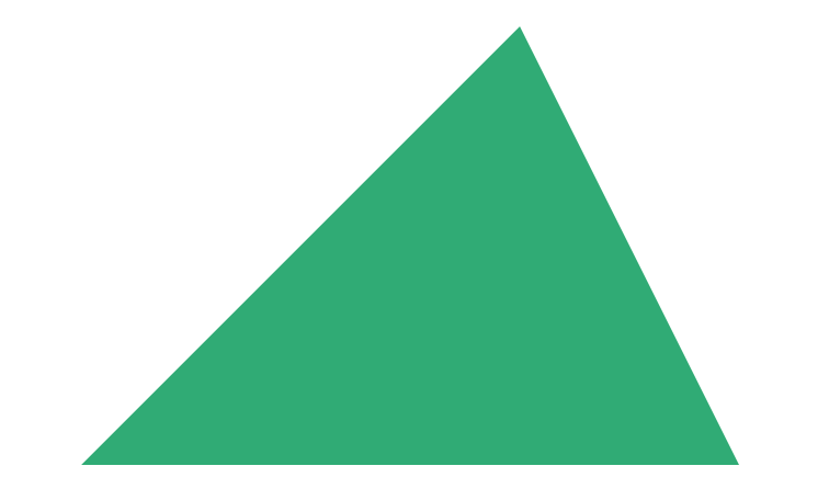
这个混合器(function)的功能就是画出一个正三角。
由于如果设置一个元素,这个元素的宽高都是0,然后设置他的边框,那么他的边框将撑起整个元素,而如果我们不设置border-top,那么上边那条边将不会被撑起,这样左右的边框就会搭起来,变成一个三角。
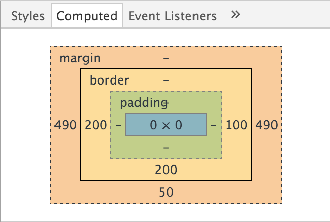
div
width: 0
height: 0
border-left: 200px solid transparent
border-right: 100px solid transparent
border-bottom: 200px solid $btn_green
margin: 0 auto 50px
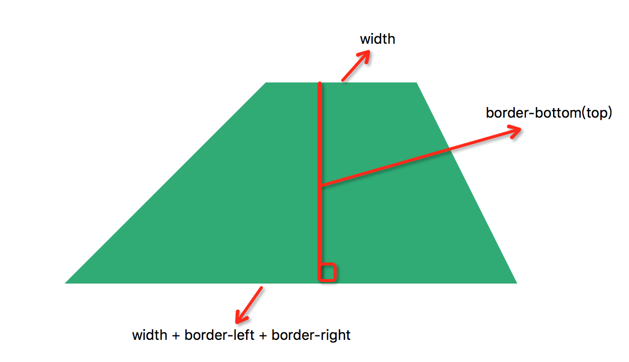
二. 再画一个梯形
理解了以上如何画三角,那么我们来想一下如何画出一个梯形,基于之前的理论,如果我们设置一个三角元素的宽,那么这个梯形就会形如:
顶 = width;
底 = width + border-left + border-right;
高 = border-bottom(top)
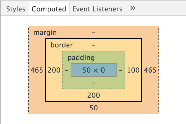
div
width: 50px
border-left: 200px solid transparent
border-right: 100px solid transparent
border-bottom: 200px solid $btn_green
margin: 0 auto 50px
三. 方块变梯形,变身。
完成了上述两个『mission』之后,我们要实现的动画就会比较简单了,只是在要改变的元素上添加上动画就可以,然后在 hover 样式中将正方形变成梯形即可完成变身。
.test
margin: 100px auto 0
width: 1180px
height: 590px
position: relative
> div
height: 500px
float: left
cursor: pointer
z-index: 5
@include transition(all .5s ease-out)
> .left
position: absolute
top: 0
left: 0
width: 50%
height: 0
border-left: 0 solid transparent
border-right: 0 solid transparent
border-bottom: 250px solid $btn_green
&:hover
border-right: 500-60px solid transparent
z-index: 10
width: 590+150px
> .right
position: absolute
top: 0
right: 0
width: 50%
height: 0
border-left: 0 solid transparent
border-right: 0 solid transparent
border-bottom: 250px solid $btn_orange
&:hover
border-left: 500-60px solid transparent
z-index: 10
width: 590+150px